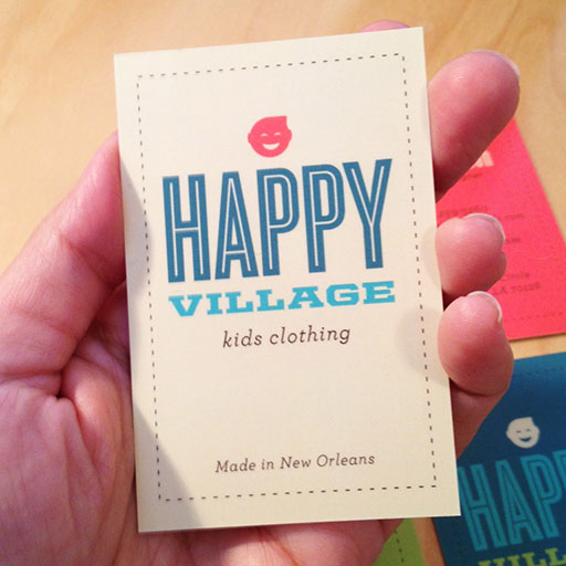
Happy Village is a handmade kid's clothing company in New Orleans. I created a logo and business cards that communicate the brands fun and kid friendly clientel. The type in the logo has in-line strokes to create movement and the lively colors make the business cards fun and vibrant.

New Work: Latina Bloggers Connect Website Design

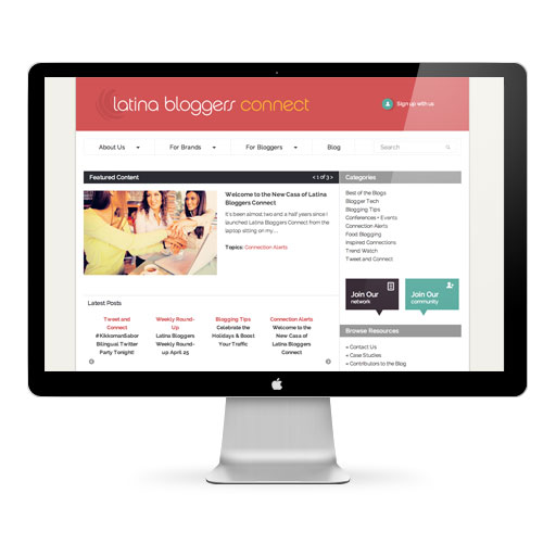
Latina Bloggers Connect offers both bloggers and brands ways to partner with the Latina blogging community. The site launched in 2010 using basic Wordpress template functionality. The visual and content focus of the first site was the blog itself, which communicated best practices, info about upcoming campaigns and more to the bloggers themselves.
With success, content and connections grew, and LBC needed to re-imagine its website. The linear nature of the blog had made it difficult to find "overview" information, and brand-manager audiences had to hunt around for more information on working with the LBC team. The new site needed to be easier to navigate and provide clear information about the services and opportunities available.
We redesigned the site so that first-time brand and blogger visitors could intuitively find in-depth information about working with or joining LBC. The home page now provides three slices for visitors to explore: About Us, For Brands and For Bloggers. LBC's social media assets are interwoven with the new template designs — recent blog headlines, tweets and Instagram photos automatically populate the footer — which instantly communicates the diversity of platforms and assets available.
We developed content that provided more context and education about LBC's efforts, including clear calls to actions so that bloggers and brands would sign up to connect. Using fun, welcoming graphics and a tone that adds Spanish phrases into the mix, the site highlights case studies, bloggers and brand partnerships — the true success stories at the heart of the LBC brand.
We continue to use Wordpress as the content management system for the site, but developed custom template options to allow for greater sophistication in selecting the most strategic content for features, presenting "static" content, and weaving blog headlines in appropriate venues using "tickers" and related posts dynamic functionality.
Over the course of four months, a three-person team took the new site from idea to launch.
Visit Site: www.latinabloggersconnect.com
Design Makeover
Last fall I was contacted by Jake Widman. He is an editor for the magazine Photoshop User. He invited me to be a contributor to their Design Makeover column for the December 2012 issue.
Photoshop User magazine publishes the “Design Makeover” 10 times per calendar year. The “Design Makeover” presents a work that is currently in the marketplace along with three “redesigns” of that work. I was one of the three designers featured in this column.
The assignment was to redesign Dawn Marks photography site. I wanted to make Dawn’s site feel more like a photography blog than just a portfolio site. I started by dividing the page into two columns. The wide column on the left shows Dawn’s portfolio, while the column on the right is dedicated to events, booking a session, contact information, and so on. I kept the existing navigation with only one edit. I created a new button for client login in the navigation bar. I wanted clients to be able to find the login button quickly, so they can view their proof's more easily.
By creating galleries and category label graphics on the home page the site is able to showcase the type of photographs Dawn is capable of creating. Dawn’s target demographic is single women and moms, which is why I chose a feminine color palette.

New Launch: New site redesign for ME
Happy to launch my new site redesign using Squarespace. I moved my site from Cargo, because I wanted to be able to have more functionality. I love that my new site has a blog area and that it is also mobile friendly. I also like that the design is cleaner and has less clutter.
Go to site: www.mariaetkind.com

New Work: Cajun Spirit Site Launches
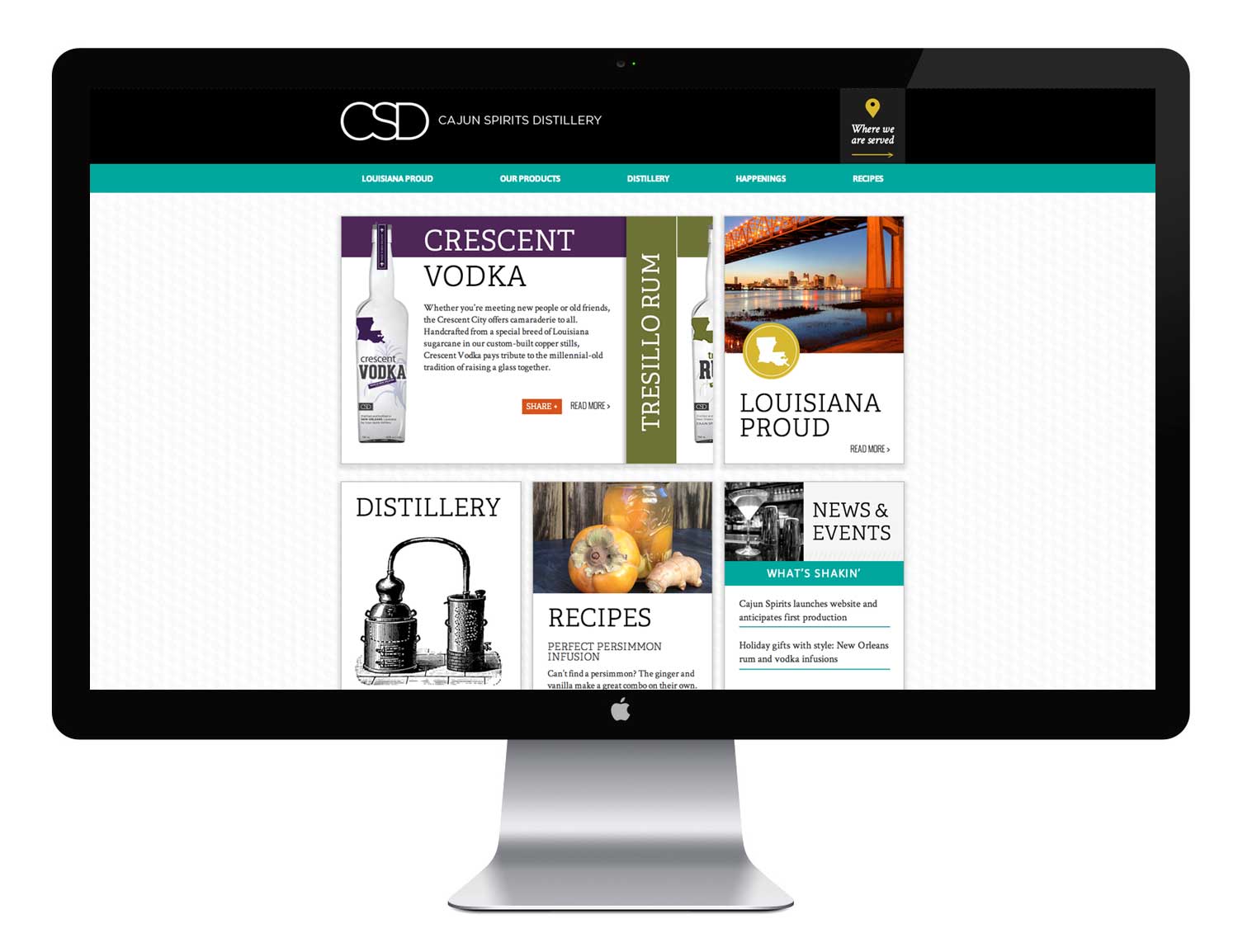
Cajun Spirits Distillery — the first distillery in New Orleans planning to produce a comprehensive selection of spirits using sugarcane — needed to launch their brand and products via the web. Bottles have yet to hit shelves, and CSD wanted a place for people to learn about their rum, vodka and gin.
I worked in partnership with Karen Buck to develop a brand creative concept and copy for the website that juxtaposed archetypal New Orleans music, history and culture of New Orleans with a modern, cosmopolitan aesthetic — a match for the “New New Orleans” entrepreneurial culture that the distillery is a part of.
Erin Allen implemented the website using WordPress to allow for flexibility as the distillery grew and added new products and promotions. Custom programming added interactive features such as a home-page product slider, a location map and “ambiance quotes” featuring comments on New Orleans and spirits from notable and notorious personalities alike.
We expect to extend the brand campaign to other tools as CSD grows.
Got to site: www.cajunspirits.com